Lauterwasser
Critical Reflection
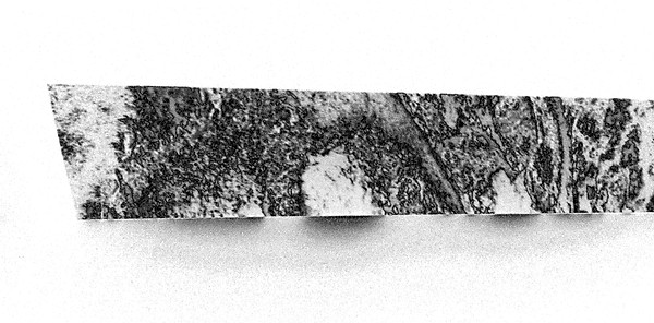
I began by looking at a series of photographs of machine parts that were taken when we cleared my father’s house in France in 2010. They reminded me of the images I had been making during unit one.
I was interested in using these pictures for several reasons;
-
they are figurative images with identifiable forms, however the use and reason for the objects is not immediately obvious.
-
They are not aesthetically considered images as they were taken for illustrative purposes. They are dimensionally flat images from a single view point.
-
I have a strong emotional attachment to the experience that accompanied these images, however this is not clear in the photos.


They provided me a platform to reform new environments in which the connectivity of objects and surface could be used to create a liminal, emotion space. I referred back to Phillip Guston, but also now to Paul Cezanne, a key influence on Guston) and analysed the following aspects of his work:
-
The importance of dynamic planes positions throughout a composition as device for tension. By varying distances between planes rhythmic tensions are developed, particularly in collaboration with off-vertical plumb lines and multiple eye levels and angles.
-
The scale of objects artificially expands and contracts to satisfy the requirements of the composition and in accordance with the emotional associative significances.
-
Colour relationships; warm colours advance, cool colours recede.
I reformed these images into three dimensional shapes that could be combined or repeated to create artificial environments. I aimed for these spaces to have a sense of tension or of being unresolved. I combined the objects, placing them in a readable space, and modified the scale to create perspective and depth. I also overlaid the objects onto actual figurative spaces that I had photographed.


I recognised a more computer rendered environment in these images, more similar to a video game or a crude science fiction aesthetic. While I found the more structural elements of these images interesting I preferred the more granular dissonant qualities of previous work. This previous style connected more to the psychological emotional themes that I was engaged with. I decided that it was important to create new images as a starting point to develop further work.


I began looking at tides, a continuation of an interest in dusk and dawn. Reflective of a broad thematic interest in cyclical events, events that overlay, affect and are connected across time and space. These forces dictate our conventions of time, but seem paradoxically out of our time.
I looked at the schedule of tides, rising and falling twice a day and rises to different heights through different seasons. The greatest discrepancy between high and low tide occurs when the moon, earth and sun are on a single straight axis with the earth at the centre. Rivers flow in a definite direction in response to the tide, either ‘up’ or ‘down’, they also simultaneously swell and contract at the banks.
The rising tide conceals while the subsiding tide reveals, the presence of one thing by its nature conceals another. I am interested in the dialectic nature of this event, a previous state is surpassed next, but in doing so a new state is created, which is in turn reversed as the tide falls. The cosmic forces that dictate these events are consistent and long term, almost incomprehensible in relation to the experience of our lived environments. They have have a stability that provides structure for us to hang our societies on and our behaviours in response to.
Cosmic forces are the consequences of vast physical forms, however, they effect the details of our everyday lives. I am interested in creating an analogous connection between these vast forces and our own personal experience, connecting them to our consciousness and subconsciousness.
“The unconscious mind is vaster than the conscious.” - Carl Jung
I am interested in exploring the analogy of the subconscious as a metaphor for massive cosmic events and consciousness as a metaphor for the subconscious, dictated to by a much bigger force.
“When we lose a person we begin a process of finding them again within us.” - Sigmund Freud
I found this quote interesting in relation to the notion of a human experience of cyclical events, of the end of one thing being interconnected to the start of another. The effect of one event leads to a gestation period that builds upon what has gone before, and modifies us in relation to our sense of self. These events are ongoing in the experience of our lives.
I made a series of photographs observing the effects of tide on the bank of the Thames in Bermondsey. I was interested in the water and the effect of the water, if other incidental figurative elements were captured they were there as a consequence of their interaction with the water. Photographing these sequences meant staying in a fixed position on the shore of the river for a period of time as the water rose. Stairwells and ladders were located along the shore, however, despite the incremental nature of the rising water there was a moment when the tide seemed to rise more quickly and gained ground on me in a surprising way. This experience was profoundly different from being in internal space.


I brought the photographs of this experience back to a familiar internal space, and in doing so hoped to investigate through contrast the experience. The images were projected onto spaces and surfaces within my home. I was interested in how the two environments integrated and how simple identifiers could be used to communicate internal or domestic space. Continuing motifs from unit one, I projected onto simple angular surfaces, elongating and contracting imagery along planes and connecting different elements.


I found the corners of rooms an evocative space. Formed of a half box or a room within a room; a space simultaneously inside and out that can be entered and exited and therefore speaks the language of both internal and external. I was interested in this relationship and how one can bestow its language on the other. In relation to internal and external as places of experience and realisation:
“She had been playing houses in a nook right in the bows (a corner) of a ship at sea and tiring of it [she] was walking aimlessly aft. . . when it suddenly flashed into her mind that she was she”. Jean-Paul Sartre
I projected the sequential imagery of the rising tide into corners, the images were set to automatically change in order, so that the tide would rise and fall. Again, I recaptured these scenes photographically, on a timer, which resulted in a new series of images that were imbued with both sets of language.


Using a series of these images I began preparing an ambitious multiplate etching. The sequential nature of the images translated well into a series of plates that would form a single image. I had the following intentions for this print:
-
Overlaying areas (achieved through multiple plates) to create depth, rhythm, and cyclical motion.
-
The colour palette should speak to the subconscious and ambiguous sense of time; deep reds and dark shades.
-
A final plate would be used to overlay on the previous layers to unify the image.
-
Simple motifs of internal space, present but not overt. Speaking to both internal and external environments.
Technically, this was the most advanced etching I have made. Experimenting with different layer order, different opacity of inks and registration all proved lengthy and led to a rigorous examination and development in my understanding of the process.


I continued by developing a new series of images. I wanted to find a place that further distilled the themes I was looking at and found an area in Essex where the Thames Estuary meets the coast. This area has an acute tide that advances and recedes over a large area, twice a day revealing large parts of a natural landscape consisting of saltmarsh, mudflats, lagoons and a wide range of vegetation.


After several hours of walking I found a tidal mud pool within the estuary. Initially I thought it was an empty mud lined crater, however coming back several hours later I found it dramatically changed. At low tide it was emptied of all water, the surface hollowed out and craterous, at high tide however it was filled to the brim by the incoming tide, a flat mass of water. The pool was in a constant state of change. As far as I could tell there was a single point of entry for the water, a tunnel underneath a land bank on the west side of the pool. This point filled and drained a large mass of water every twelve hours, always in motion, concealing and revealing. There was a fantastic cyclical energy to the place. I focussed on documenting this environment and made two large series of photographs documenting a single cycle of the tide.


I projected and reinterpret these images, however this time, instead of using an existing domestic setting I built an object on which to project. This object was informed by the ‘domestic corner’. I sought a simple angular structure that replicated the domestic wall, made of similar materials (mdf) and painted with white emulsion. I incorporated cyclical themes, evident at the tidal mud pool and throughout my research, to develop this structure. The corners repeated and continued, the end of one became the begging of another.
I projected photographic images of the mud pool onto the object I had built, photographing the results. There were several key factors to consider:
-
The angle of the camera in relation to the scene. Images felt intimate and receding at high angles, whereas shooting from below gave the impression of vast climbing structures.
-
The angle of the projector in the relation to the scene. Light can be greatly stretched along a plane, depending on the angle of the projector. The structure distorts the projected image, revealing areas and concealing others through magnification and changes in intensity. A single cohesive image can be broken apart into a sequential, modulated.
-
Against a dark background the flat conjoining planes of the object gave the images the impression of stiffly folded paper and contributed towards a dissonance between the object surface, the craterous subject matter, and the transient nature of the projected light. This leads to a questioning, of image content in relation to the structure and physicality of what is behind.


I began work on a large, repeating woodcut relief print. This was a significant undertaking that took place over the course of several weeks in a number stages:
-
Selection of image and development of digital artwork and laser cutting.
I broke the photographic image down, separating it into the three layers, light tones, mid tones and dark tones. The mid tones and the dark tones would be printed from blocks, each from a unique matrix, the light tones would be unprinted and therefore the colour of the paper. A series and sharpening and dither effects were applied, followed by a down sampling to 110dpi before the image was separated into three separate images by colour. Tests were carried out on the laser cutter. Considerations were made in relation to material size and cutting depth and speed. This led to each of the two printed layers being broken into a further three separate plates. The plates made of plywood, a surface that I was familiar with from last term’s large wood cuts, and whose material qualities (grain: quality, direction and interaction with image) I could incorporate into the finished image.
-
Preparation of material and paper
The surface of the laser cut plates were blown out and cleaned before having a shellac coating to prevent ink absorption as well as to preserve the material. A number of colour tests were carried out, initially digitally for a broad impression, then mixed in ink, and swatches made for specificity.
For constancy and to avoid running out of ink mid job I mixed a large quantity and dispensed it into empty cartridges before starting printing. The mid tone grey was made with metallic silver and titanium white, and the dark tone with orient blue and a small amount of magenta and burnt sienna. Cobalt driers were applied to batches on the day of printing to speed drying, this was important as a number of separate prints needed to be made to each of the long sheets over a short period. Paper was measured, cut and marked on reverse to assist with orientation and registration.
Using the Beever’s press it was necessary to custom make registration methods; infeed/outfeed surfaces and clamps. Due the size and quantity of the works I set up a series of drying racks to order and separate drying works.
-
Printing
Over the course of four weeks, I printed 12 works, each consisting of 6 plates. It was a technically and physically demanding process.